This week I have been really finding my feet with the systems of how the MA works. Though I did my degree through online methods during Covid, this is all completely new to me. How things work and how Canvas is used, I think that it is really helpful and having so many resources available to me, I just don’t know where to begin with it all. The resources is a nice way to start and think about how I am going to work through this degree.
DRIP DRY SHIRTS; The evolution of the Graphic designer – Lucienne Roberts
These are the notes I have made from reading through this on TALIS.
19th century
- The term graphic design is recent in terms of visual arts. The activity itself refers to and dates back to the earliest cave wall scratching.
- Most early printed advertising was very thrown together and wasn’t refined or detailed. This was because the relationship between client, printer and engraver wasn’t structured and didn’t really exist.
- Type designs had a lot more variety. Style and weight were developed to provide impact in the market.
- Late 19th Century saw a growing awareness of Japanese art which encouraged the use of flattened perspective, heightened colour and strong simple forms.
- This was how art nouveau was developed. A single style that used flat colour and strong line use and organic effect and was integral to the design.
- Technological changes within the industry led to the almost disappearance of skilled engravers. These were craftsmen who had learnt within the trade.
This was a really interesting read and has helped me to consider and understand how graphic design within the 19th century really compared to graphic design of today. Things we take for granted today such as the use of computers and software developments that we so freely abuse for fun, was virtually non-existent. The fact that type had grown in style and trend at this stage of history as well really intrigues me to think about how type was really used with the 19th century and is something that I need to explore in the future.
Artist Inspiration
Vaughan Oliver
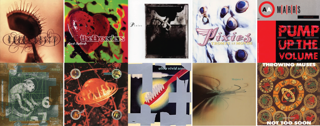
https://www.designboom.com/design/interview-with-graphic-designer-vaughan-oliver-12-19-2014/
This collection of imagery were all designed by the late Vaughan Oliver. A British born designer that entered the world of art and design through his love of music. Bands he has designed for include: The Pixies, The Breeders and David Lynch to name a few. From the guest lecture on Canvas, I was reading an interview with designboom, in which the first opening question was ‘ I read that you became interested in graphic design through music?‘ This question really resinated with me as I too fell in love with album covers from a really young age. As someone that was raised on a mix of classic rock and pop music throughout the early 2000s, the level of artist artwork on album covers was quite varied and quite eclectic. A quote that really stuck out to me within Oliver’s response to this question was:
‘Everything that I was getting was through record sleeves. It was a democratic way of discovering art. The local record shop was a gallery for me’
Growing up, my parents didn’t really have an interest in art, which still to this day is the same. To the point of my Mum referring to my work as ‘Quirky’ (in other words she doesn’t understand it and she’s not going to) but my dads CD collection and his ever expanding records have been amazing visual inspiration for me. Even in some cases the use of just colour, or just typography. Visually, the albums within the collection have inspired me to design and continue to inspire me.
Sister Corita Kent
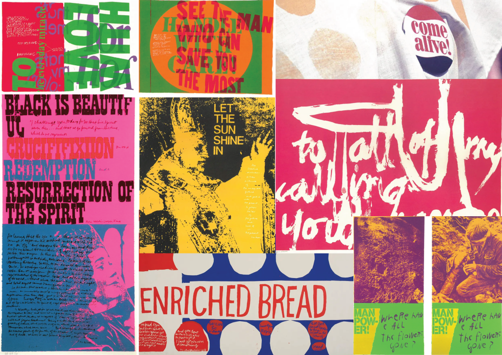
https://www.itsnicethat.com/features/corita-kent-ray-smith-art-international-womens-day-080318
Known as the ‘Pop Art Nun’ Sister Corita Kent is an expressive artist that was known for her use of shape and colour to create vibrant, enthusiastic and hopeful art work. She was known to use text or song lyrics within her work. ‘snippets of popular culture’. Sister Kent’s work has been described to have ‘Magic-8 ball quality’ to it. It has this almost mystical ability to reach people. When I look at this work, I instantly feel inspired to design. Sister Kent’s work is so bold and vibrant. Her use of colour has this ability to drag your eyes into the art work and never let them go. The use of type within the work is different every time too. The use of different styles of typeface and adding in the ability to incorporate hand drawn lettering is truly inspirational. Sister Kent’s work will be with me for a long time and will continue to inspire me visually always.
Studio Research
As part of the weekly task on Canvas, I was tasked with exploring local artists and design studios within my local area. I feel like this has allowed me to consider and explore how the professionals do it.
Split Design
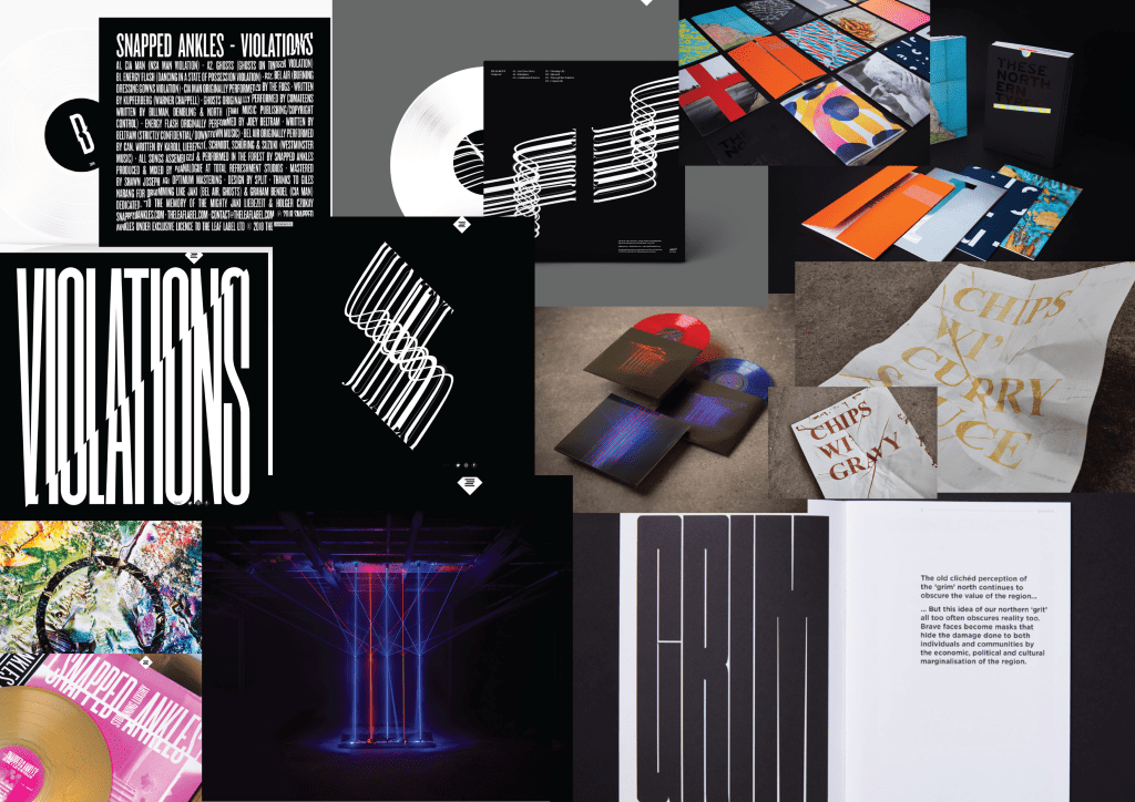
Split Design Studio is a West Yorkshire based design studio that specialises in design for the creative, cultural and non-profit sectors. The work from this studio is in my opinion phenomenal and visually inspiring. The thing that I love most about Split is that they explore all of my favourite parts of design and it is a over arching umbrella of fun with typography, editorial and print based skills and reimagining it to create stunning visuals. I first found Split during my degree at Leeds Beckett during my second year and I have followed the work of Split ever since. I am in the process of contacting this studio for any advice that they may be able to give me as a start within the design industry.
The task for this week was something that I started with great hopes of having this giant bank of local design studios, but upon contemplation, I have decided that I am going to keep coming back to this task as I feel that this is something that I am always going to be look at and always going to be considering through out my design career and to look at all these studios at once in one single task isn’t going to be the best use of my time at this stage.

Leave a comment