This week, I have been trying to come up with the big idea. That concept that will make this unit of work sparkle. I have been exploring issues within my area and I have been coming up with new and interesting concepts to try and get the ball rolling with this work. The main issue has been time management. Work has been super busy as usual and I am still trying to keep myself motivated, but I am here and I am still progressing so lets do this… I think.
Big Data
Ancient Visual Communication
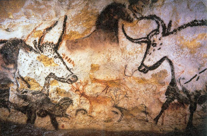
Lascaux, France – hunting scenes, abstract symbols.
- Location: Lascaux, France.
- Content: Depicted hunting scenes, human figures, and abstract symbols.
- Purpose: Likely used to share knowledge and stories within and between tribes.
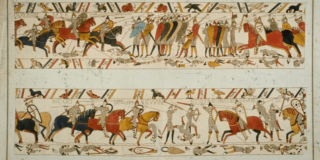
Bayeux Tapestry: Story of the Battle of Hastings, minimal text.
- Content: Illustrated the events leading up to the Battle of Hastings in 1066.
- Features: Minimal text, primarily visual storytelling.
- Audience: Designed for an illiterate audience, relying heavily on imagery.
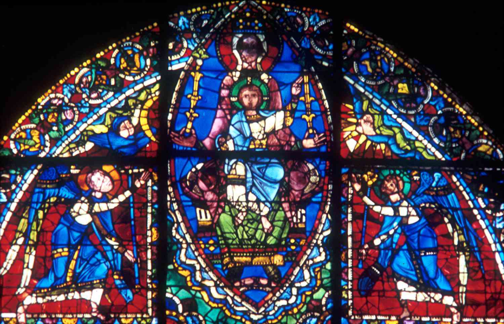
- Christian Churches: Used visuals like stained glass windows, painted panels, and illuminated manuscripts.
- Purpose: Communicated religious stories and messages to illiterate congregations.
- Impact: Created awe and conveyed complex narratives through visual means.
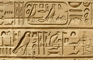
Hieroglyphics: Egyptian logogram
- Culture: Ancient Egypt.
- System: Logograms (pictorial symbols representing words).
- Comparison: Similar to modern emojis, used for efficient communication.
These ancient forms of visual communication were essential for conveying complex ideas and stories in a time when literacy was not widespread. They laid the foundation for modern information design by demonstrating the power of visuals in storytelling and knowledge sharing.
Modern Information Design
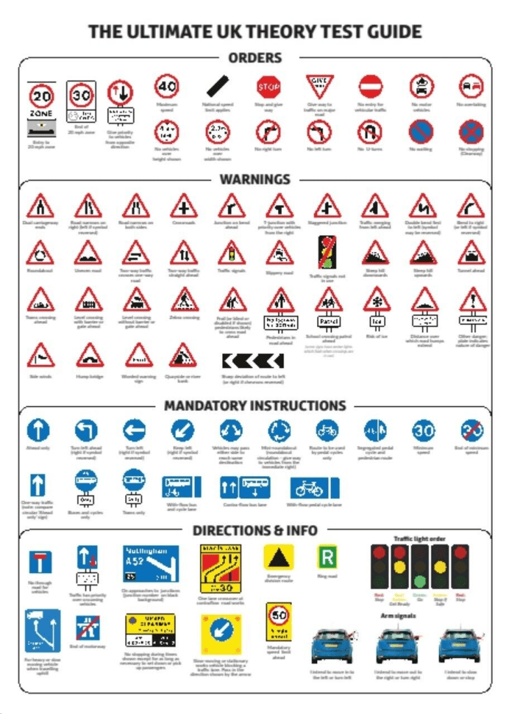
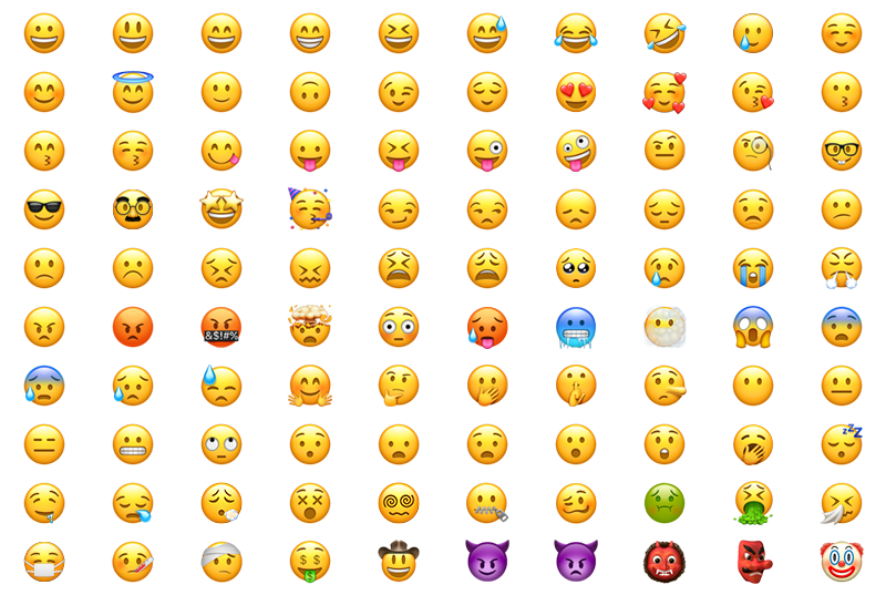
Road signs and Emojis are modern forms of information communication that simplifies communication across different languages and cultures.
THE SOURCE

- The Source is a kinetic sculpture created by Studio Greyworld for the London Stock Exchange.
- Composed of 162 cables arranged in a square grid, reaching eight stories high to the glass roof.
- Each cable has nine spheres that can move independently up and down, acting like animated pixels.
- The spheres create dynamic, three-dimensional shapes that rise, dissolve, and reform.
- Shapes include figurative and abstract forms, such as the sun rising, stock names and positions, and a DNA helix.
- Represents the activity and fluidity of market forces.
- Acts as a living reflection of the market, with its constant motion symbolising the dynamic nature of trading.
Big Data lecture summarised
- Simplicity and Clarity: Essential for effective design.
- Visual Communication: Evolving from ancient times to present.
- Role of Technology: Enhancing data visualisation and interaction.
Information is Beautiful – David McCandless
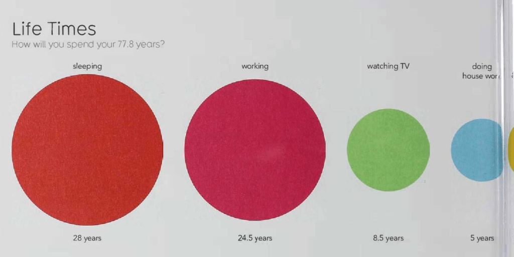
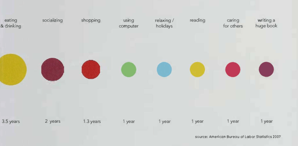
This work is from the amazing book Information is beautiful by David McCandless. Within this book, there is a vast range of beautiful and simple infographics. These designs all display a range of information in new and interesting ways to try and entice the reader into learning about facts in a more unique approach than simple boring facts. This is a really interesting concept to me because it takes something so mundane and boring and re-invents it into something more beautiful and worth looking at which I think is a really exciting concept. Given the opportunity, I would like to produce a piece of work that would work as an interesting infographic.

Leave a comment