This brief is something new that I have never encountered before. It requires me to look into and think about my local area in a complete new perspective. This may prove a bit of a challenge for me seen as I have lived in my local area for the last 22, nearly 23 years. So I think I know the area inside and out. I don’t think that there is a part of my area that I have not yet seen, but I am looking forward to the challenge. The major issue is that my area is undergoing major change. Things are changing more and more all of the time, and not really gradual, it feels more like it is an accelerated change and not slowing down.
Starting point
My initial starting point for this project was to start to look and think about my local area. My first initial reaction to the brief was that it was asking me to show off my local area so that people can try and get to know me. So from this, I decided to mark every location around my local area that has some significance to me. And as part of this, I went out and took photos of things around my area to document them. I had started to take photos of things and see what happens and then think about how I am going to represent this.

I then went back to the brief… I re-read it and realised that it was asking me to produce a piece of work to get to know me. It is asking me to show what makes my location different to everywhere else. So for me this meant going back to my map and looking at the special places that my location has to offer.

So as I said, I went back to the drawing board and I tried to have a look at different parts of Hoyland that were special and I kept on hitting a bit of a brick wall. We have a couple of special areas, but change has caused a lot of destruction and removed a lot of those special places. I kept on thinking that there is a lot of special places in outside of Hoyland in the neighbouring areas, but not in my zone for the project… So I expanded beyond Hoyland.
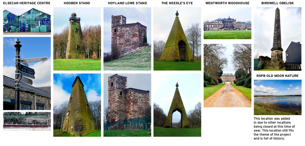
Because there has been so much change, I started to think about the places that change cannot affect. Just outside of Hoyland there is the village of Wentworth that is rich with listed historical structures that cannot be touched by development. There are several structures dotted around my local area that are all linked together by the history of Wentworth and other historical events. After doing research on this, I found that one of those sites is actually in Hoyland and about five minutes walk from my home. I then started to mark these sites on a map to see if they brought out any distinguishing patterns and just how they look on a map.
Field trip
While out on my field trip, I was thinking about how I could showcase all of these different areas. My initial thought was to produce a bit of a photo book that would rely on the photography to speak about the rich history behind these sites. But with that being said, I thought that there was way too much back story to these sites and that needs to be celebrated within this project.
Building on this, I thought about how I was going around the sites and I was spending a lot of time following Google Maps to make sure I was following the correct route which made me think about this idea of making my project more user experience based. This would mean that people would need to interact with my project in some way either web based or application based. Which would mean that the experience would need to be branded in some way to make the experience feel more professional.

As part of my research for this project, I started to look at branding and interesting identities for locations. As part of the work from Canvas, I was watching the Netflix series Abstract in which Paula Scher was talking about her design for the Public theatre and how she new that she wanted to ‘Design something that would represent the whole of New York’ This really resonated with me because scher had this idea of a design that would represent something and an entire location of people, which to have a design represent something else entirely is an interesting concept for me to potentially work within my own design.
After completing the research, I started to look into generating names that would suit the idea of going out into the world and exploring historical sites. I started to think about this idea of the sites being quite hidden away and removed from plain sight. Then I quite drawn to this idea of blinking and missing them when out and about exploring. After spending time deliberating over names, I thought that blink was the strongest and would be perfect for a response to the project.


Once I was happy with the name, I started to design on Illustrator. My instant thought was to try some typefaces that would work with the name and see what happens. My first response was to have a look at the name in all caps using the typeface ‘Area’. This is a typeface with a number of different weights and I thought that it was a nice clean approach to the design. However, it was too bold for the name and didn’t have the representation of blinking. So I tried to make it all lower case and incorporate an illustration of an eye for the dot on the I. This made the branding feel more like a cyber-security agency. My next attempt was to use different weights of Helvetica Neue to try and represent the motion of blinking. This worked out a lot stronger and showed more of a realistic visual approach to the name. The idea of your eyes out of focus and coming into the clear. However it still felt quite bold and I wasn’t happy with the placement of the letters.
Typography
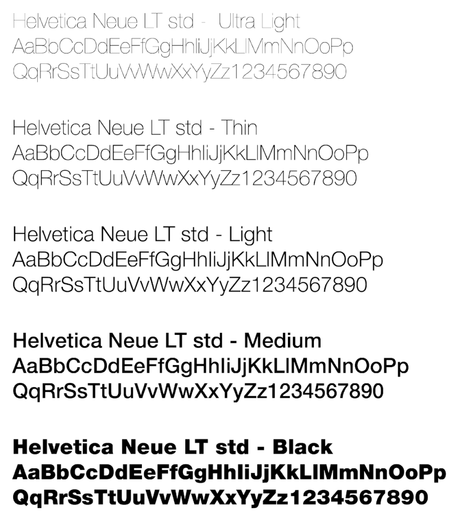
I started to play around with the placement of letters and the different weights that would work together to show off the name in a better way. This method was way better than previous and shows more of a clear defined line between the ultra light B and the black K.

This is the final branding for the Blink identity. From the previous development, I decided to take the idea of unfocused a step further by removing the stem from the B. This helped to give the brand more of a unfocused aesthetic and help improve the idea of missing. The final thing I added to the design was to put back in the dot at the end. I played around with placement and I thought that by having the dot in the middle of the arms on the K, It gave off a bit of an abstract shape of an eye. I am really impressed with this design because I think that I have managed to encapsulate the essence of what it means to go through the blinking motions and really represent the word. This is something that I have never done before within typography and I am impressed that I have managed to make it work.
ux production

My first initial response to the UX Design was to produce a bit of web page, where people could go on and find out information to where the locations are and bit of history about them. I designed this Geomap where the user could simply hover their mouse over a location and it would appear with information for the user. This design had a few flaws. The problem with this design was because the locations are pretty close together, it was having sensor issues and kept displaying the wrong location. This would mean the user couldn’t get the location they had requested. This caused me to think and re-evaluate the design and functionality.
After evaluating, I realised that the design I had done was more web based, which is no good to someone who is outside exploring, so I decided that the design needed to be more mobile, app based designed.
After the disaster of the first attempt, I decided that the design needed to be more simple and slimmed down so that people could follow it easier, especially when using it on their phones. This meant that I had to work out how I was going to layout the design and impalement a hierarchy structure to each page to give it more of an aesthetic balance. Then once I had the layout of each page in place, It was a case of linking the menu page to all the connecting pages and implementing a system where the user can click on an image and it would allow them to make it bigger. I think that this method of designing is really exciting and has a lot of interesting features that I am looking forward to exploring further.

Final outcome

BLINK – THE MOBILE APP – CLICK TO EXPERIENCE IT YOURSELF
This was the final outcome that I have produced for this project. This is the first time that I have actually designed something for mobile phone screen size and I think that I am quite happy with what I have been able to produce for this project. I have dabbled in Adobe XD on and off over the last few years and I have only ever needed it for small projects so to be able to produce an outcome like this has been really amazing for me to see on a smaller screen.

Leave a comment