What is it I do?
What is it I do? This part of the project should be one of the easiest because I know exactly what it is I do, but I am struggling to see how I would represent it. Heres what I do:
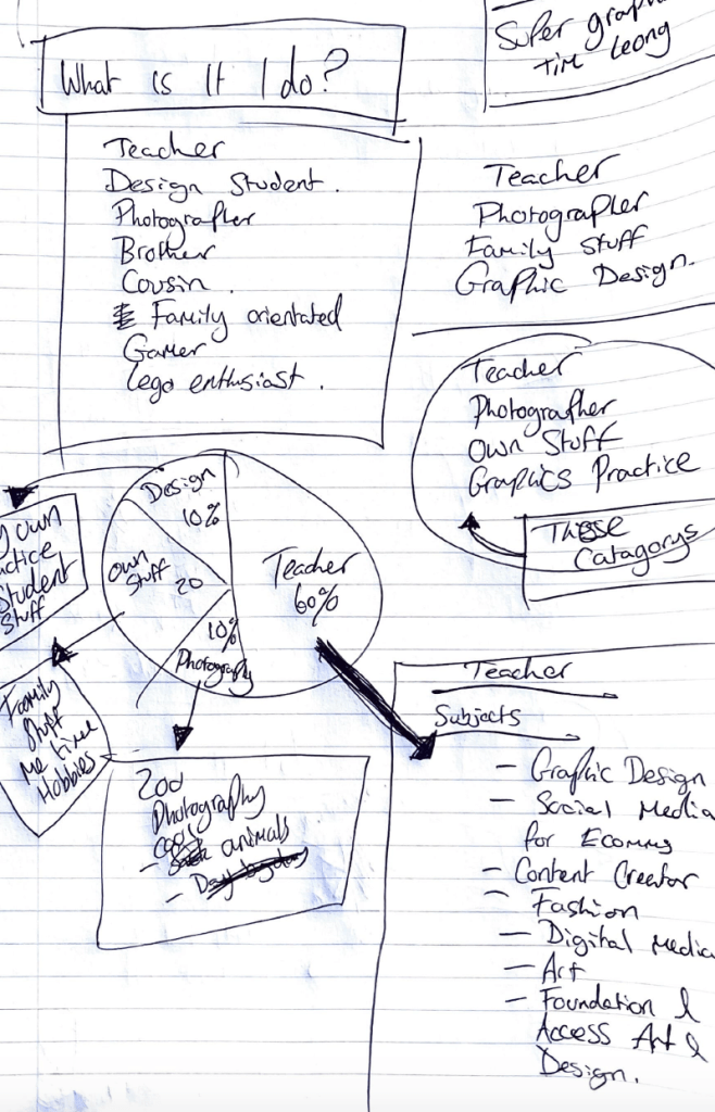
What I have done here is started to produce a list of the most frequent things that I do in my life. I then broke this down into more generalised categories. This allows me to then think about how I can expand on each point. These general categories include: Teacher, Photographer, Own Stuff and Own Practice.
I thought the best way to show this is as a piece of design was to show this as quantifiable data such as a pie chart. This would allow me to show how much time I actually spend doing each section in my life.
Visual Inspiration
Super Graphic – A Visual Guide To The Comic Book Universe – TIM LEONG


This book is one of my favourite books that helped me decide to enter the field of Graphic design. It combines my two favourite things, visual design and comic books and has allowed me to gain inspiration for this section of the brief. While I was looking through this, I found these two visually appealing pages that show how you can turn organic things into quantifiable data, which is exactly the idea that I have had in mind for this panel. The use of striking colours too helps to make the design of the pie chart more appealing, which is something I will definitely be taking on board for my own design.
Concept

This concept draws from the visual inspiration of the ‘super graphics’ book and uses the idea of displaying information in a chart. I decided that I loved how a pie chart works and how it can tell you a lot of information about a person. I decided to break this up into the x4 different categories and to show how much time I dedicate to it within my daily life. So for context, I always try and put 100% effort into everything that I do, even when I have a day off, I never stop and rest. I am constantly on the go. Even when I do eventually stop, I am always working in my head. So I have been known to try and get 110% out of a day. So I have modelled my pie chart on 110% instead of the traditional 100%.
Within this, I have included the fact that I teach and have included a break down of every subject that I currently have an involvement in delivering. This takes up around 70% of my life. I have included the fact that I have a side passion for going to the zoo and taking photos of animals. This takes around 10% of my life (though I wish it was more). There is a section for family. I consider myself to be quite family orientated. This is about 20% of my life, but again comes and goes depending on frequency of seeing my family. Then there is the section of my own practice, which is quite sad to say only takes round 10% of my life, though I am quite fortunate to have a job as a design teacher, what I consider to be my own practice is actually distilled into designing lessons and learning new skills and techniques that I then pass on to my students. And this is WHAT I DO!
Colour Palette

With the colour palette I decided to give the design a similar theme to the previous panels within this design and give a clear link between the panels and give the design more contextual relevance to me. So as I have stated previously, the orange, navy and beige colour link to the previous panels to show continuity, but then I have also added in the green and the lighter blue to the mix for this design as well. This is purely because I needed additional colours for the pie chart because of the number of sections, but also because they felt vibrant and attractive.
Typography
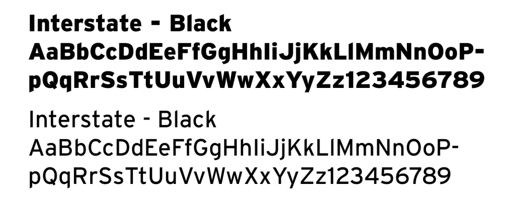
Much like the colour palette for this design, Ive decided to stick with Interstate for the typeface choice of the design. I decided to go with this typeface because of the shear amount that I use this typeface in every day to day life. Everything that I design, I try and use this typeface first because it just has a very simple and elegant look about it and can be manipulated quite easily. The amount of weights it has allows for variation within the design too and allows for hierarchy within a design too.
Final Outcome
This is the final design for the What is it I do? panel. Looking back at the previous thoughts about this section of the project, this has given me a lot of perspective on how much time I actually dedicate to areas within my life and which areas I need to shift focus from in order to dedicate time to the things that I love. I think that This method of design has been the most successful for this piece and has allowed me to explore how data can be involved within design. I think the colours are a nice touch as well to allow me to continue to link all of the panels together and continue sharing my life.

Why Design?
Why design? Well that’s a long story. Some would call it madness. Some would call it fun. I call it that little creature that annoys the hell out of me but I love it and couldn’t think of my life without it. Genuinely, Ive been doing design that long that my life has no other purpose. I have no other skills.
Luke’s life story: So when I was in secondary school, we had this bit of paper where we had to choose our subjects for GCSE study. When it came for choosing my expressive subject, I actually chose performing arts. I had this big dream of becoming an actor (so glad I gave up on that dream). I handed the slip of paper in and then went into my year group assembly and the head of year started talking about ‘The papers are in’ ‘The decisions are final’ ‘There is no going back now’. And I just remember something clicking and I demanded my paper back and changing from performing arts to Graphics. I was 13 at the time and in that moment, I made the single biggest career changing decision. I was and still am riddled with social anxiety, I was a terrible actor then and I am a terrible actor now. So my career in the arts would have been so crushed.
Starting Point
My initial starting point with this panel for this brief was more around why I actually do design. I think it’s pretty. I think it’s a cool process and when mastered can produce some amazing work. I find it really inspiring and I want to inspire people to get into the industry. I design to communicate. I design to progress and with that progression, comes a very Hobbit style journey and adventure.

Initial Doodle

Building on the idea of a journey I decided to try and do a bit of an initial brainstorm of how that might look. When I started to think about a journey, I thought about how journeys usually have a visual representation of a map and how in cartoons show a chaotic journey of someone following a map and have this really swirly choppy and changing of directions until eventually they reach their destination. this line drawing is more a free hand let my brain switch off and just let my hand try and represent that journey I am on.
Design Trial
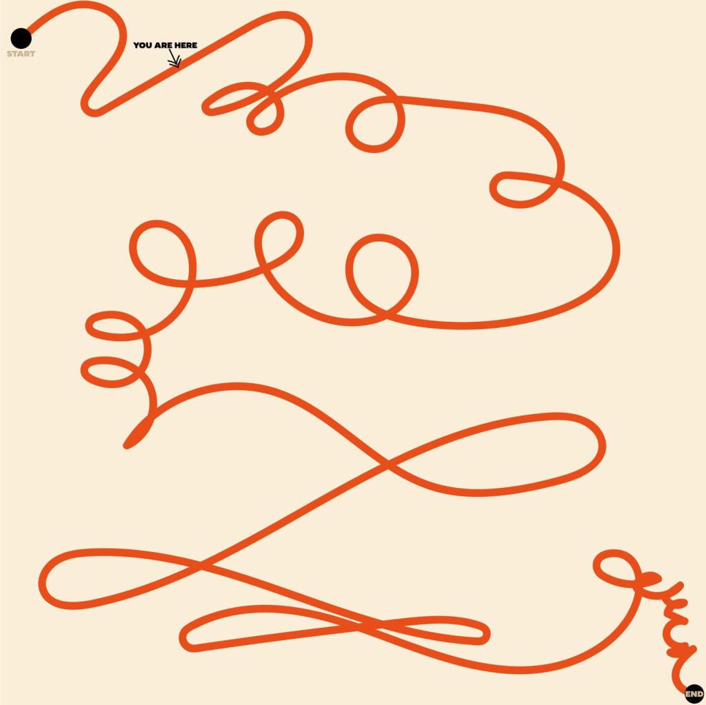
After doing the doodle on paper, I really liked the idea, I thought it was interesting and abstract and had enough motive to be considered apart of my story, So I took to Illustrator and did the exact same method as the paper and let my hand draw this interesting concept of a journey. It turned out quite ribbon like, bit with a very interesting outlook. I also wanted to add in a key indication point of where I am on this journey. And honestly, I feel like I am right at the start of the journey. I have a diploma, degree and a teaching degree and I still feel like I know very little about design.
So after design review, I was quite happy with what I had done. Until it was posed to me: ‘Why is there an end?’ And they made a very key point of you never actually stop learning. Especially in this industry where it is constantly changing and evolving and where trends come and go so quick and you have to constantly stay up to date with keeping yourself well established within the field. So I made a very significant change… I removed the ‘End’. The journey will never end…
Colour Scheme

The colours palette for this design is a lot smaller and shows a little bit of variation compared to the previous panels. This is purely down to the vibe of the design. The background is the only colour that has been continued to be used throughout the design. This is purely down to the colour being quite neutral and works well for a journey style design. The orange shade used within the design of has changed slightly. compared to previous as well. This was purely because the shade that I previously used was too bright to be used within the design and needed to be more of a darker shade but showing a clean and distinct direction. The black is a new addition to the project and has been used purely as a marker on the journey map to show where I feel that I am within the journey itself.
Typography

The typeface used within this design is Interstate again to keep it linked with the previous panels. I chose the ULTRA BLACK weight for this design because I knew that I would only need to use it on a couple of areas within this design and that they needed to be heavy in weight to mark the points as key areas.
Final Outcome
This is the final outcome for the Why Design? I feel like the process that I went through to get to this design was a lot shorter than the other designs, purely because I didn’t need to think too much about the actual aesthetic of this design. I wanted it to be very loose and without control, those kind of designs in my opinion are the best kind and allowed me to be quite experimental and expressive with the piece. I am also loving the fact that I managed to keep the beige colour within the final piece and keep the link to the other panels.


Leave a comment