I have been looking at the different ways that I have to produce the four pieces of art that surrounds and answers the WHO, WHAT, WHERE and WHY questions. I have found this very difficult because even though I can answer the questions, I don’t know how I am going to present the ideas into work that speaks about me. Starting off the progress of this brief, I have decided to focus on one panel at a time. By dedicating full attention on one panel at a time, I am allowing myself to think clearly about the work and the types of things that I want to include within it.
Where am I?
I’ve decided this is where I am starting. This is my easy way into this brief. I am from Barnsley, South Yorkshire, a market town that has more interesting elements in the surrounding areas than what is actually going off in town. Barnsley was one of the old mining towns that was known for its coal and glass production and its accents. Honestly the accent gets on my nerves after a while. I hate telling people where I am from. Especially if its someone of an older generation. Whenever I say ‘I’m from Barnsley’ 90% of the time I am met with the response of ‘Baaaaaaaarnsley’ in what is supposed to be the Barnsley accent, but is never right. I have considered producing work looking at the local dialect of Barnsley. But honestly, it doesn’t interest me. I get PTSD flashbacks to the ‘Baaaaaaaarnsley’ response and it makes me dislike the local dialect.
I want this first piece of work to be interesting and visually appealing to not just me, but to people that look at it as well. I want people to get to know me through my interests and hobbies and I think the quickest way for people to understand me is through my music tastes. Some would say that I have quite an eclectic music taste… My daily music really does change with my mood. If I am feeling quite inspired, I will use more upbeat pop hits. If I want focus. I will use more indie rock hits. If I’m looking to just release energy. I will use hits that I play on repeat (these are usually a mix of different ear worms that I have caught my ears).
Starting point… music
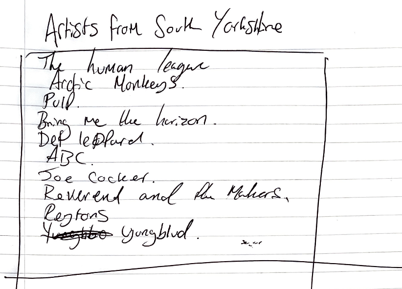
The problem I have is that there are not many well known artists that come from Barnsley. I certainly can’t name one. But there are a very wide range of artists that I know of and listen to from the wider range of South Yorkshire. For people that don’t know. South Yorkshire is made of Barnsley, Sheffield, Rotherham and Doncaster. These four districts are home to 1,374,182 people. and has produced some amazing work from bands such as Def Leppard (Sheffield), Arctic Monkeys (Stocksbridge), Pulp (Sheffield), Yungblud (Doncaster) and so many more.

Initial Concept
So to make this more personal, I decided to make things more interesting and pick artists that I listen to regular and look at their songs and see how I could represent these in a typographical approach. I found that this made the work look too chaotic and show a very explosive style which I wasn’t aiming for. I wanted to be more expressive and show a more clean and visually appealing representation of the songs and their artists.
Visual Inspiration
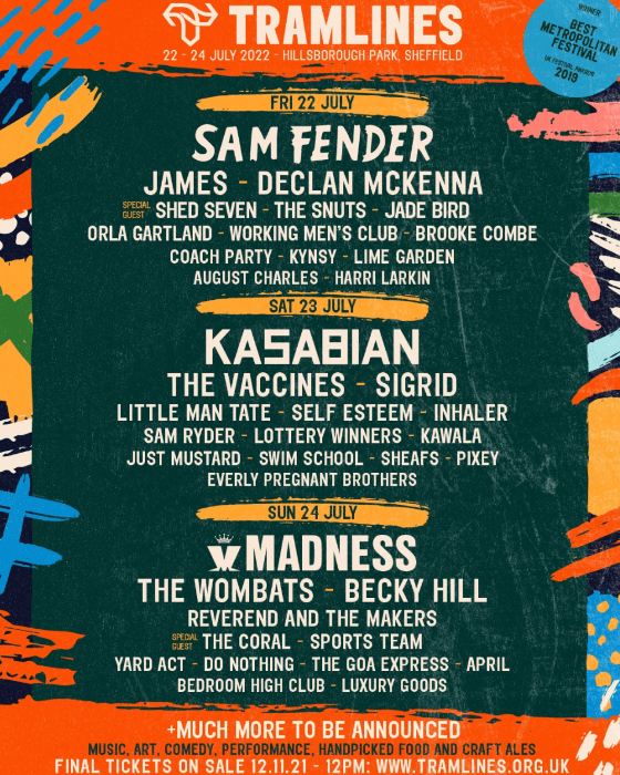


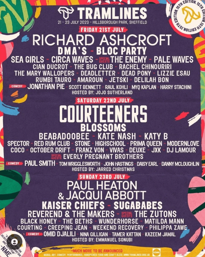
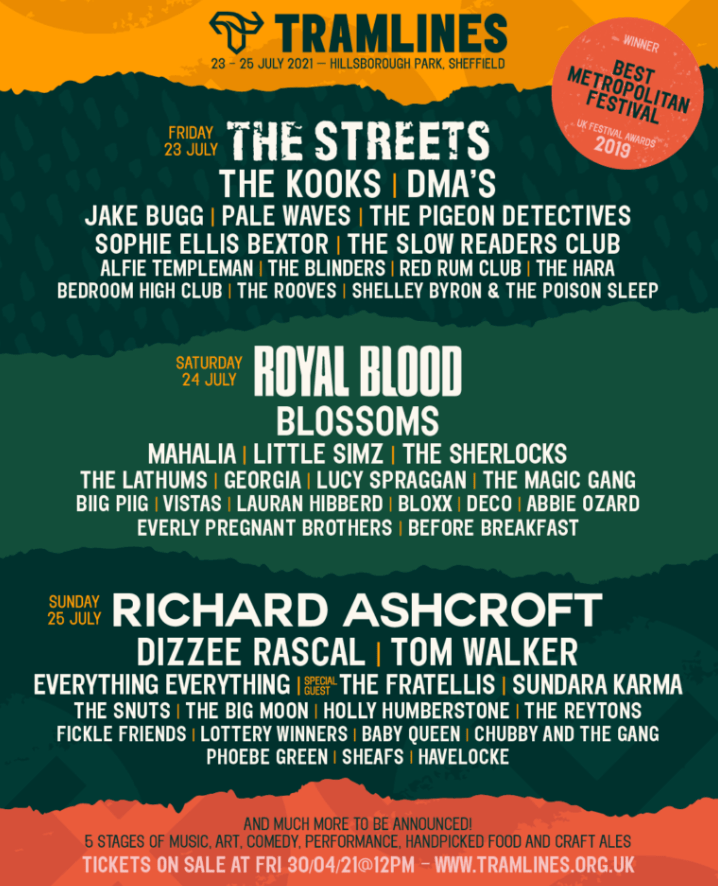
My inspiration for this work was ‘Tramlines’ Music festival. This is a local Indie music festival that invokes a clean use of typography, colour and layout to their posters to show the day break downs of the artists. The designs show a range of expressive colours and illustrations which is very symbolic to the music festival where the artists will perform their expressive music and different styles. This is a cleaver link between design and function and is something I would love to express within my own work.

Concept .02
So to break it down further, I looked at a more designed approach with considerations to how type, colour and illustration would interact with each other. I decided that the names needed to take centre within the design and that the illustrations needed to be more of a engaging, appealing support within the design and not take centre. They needed to work with the type to make them stand out. The colours need to be bold and striking, but not so much that they distract from the main focus of the artists songs.
Typography


As part of the design process, I decided that I needed a typeface that would act as heavy weighted typeface that would create a sense of hierarchy within the design. This includes the title and then onto the songs themselves. The typeface Altivo was perfect for this because of the amount of weights included within the font family. It allowed me to have a heavy typeface that could be manipulated and distorted to produce the ‘headline’ song. and have the rest at a visual and clear medium weight.
Colour Palettes
The colour palettes that I have used within this come from my research on existing Tramlines posters. One of the colours that I really wanted to make sure I had in the work is the orange. This is purely down to me having a connection to the colour and made the work seem more personal. For context, most of my friends refer to me as ‘Ginge’ so by including this colour, the work feels like mine.
Final Outcome
This is the final outcome of ‘where are you’. Within this design, I have expressed the importance of music within my life and where I am from affects my life through song. I really like this design, I feel like I have expressed this well within the design and the use of expressive colours and Illustrations to bring out a ‘teaser’ of some of the music from South Yorkshire and what we represent. As I said earlier on within the project, there are a few things about where I am from that really grate on me and make me feel like I am placed within this box because of where I am from, but expressing the music by artists that originate from my area really make me proud to be from South Yorkshire.

Who am I?
Who am I? That is the question. I know who I am and sometimes I like myself and sometimes I don’t. I know for certain that I am not enjoying producing work about myself and that is why I have not started the brief with who I am. I try and take myself out of my work. I believe in staying impartial to my work or I will get attached to it and make mistakes. I feel design works better for me when I am not a deciding factor.
Initial Concept
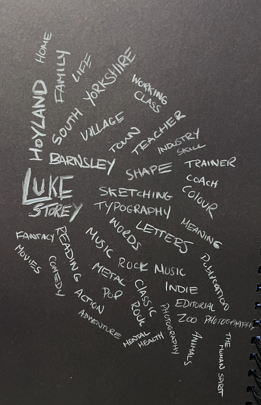
To start with, I began by looking at who I was as a person. Who am I across every level and to be honest when I see this image, it makes me a little sad because I can be reduced down to these few words and makes me seem really boring. I love typography. It is one of my favourite parts of design. Its elegant and as I tell my students ‘typography can speak a thousand words’. But this doesn’t do that. The layout is all wrong and too chaotic. I do quite like the use of different angles to write the words, but this would need to be handled with the right context and not used haphazardly.
After completing this first concept, I decided I wanted to go back to the drawing board. I felt like I needed more impartialness within my design and that I needed to see this from the perspective of someone else. It was at this point, this struck me to include my friends within my work. One of the main issues with the initial concept was that I needed to include something that was less boring, which (I am hoping they would never think that I am boring) is why I am friends with them. So I sent the message: Tell me about Luke Storey?
This was the following responses:
- ‘Ginger’
- ‘Dedicated and committed teacher’
- ‘Continuously moving forward, never stalling’
- ‘Luke manages to find a way through any given task whilst creatively and positively leaving his stamp’
- ‘A no nonsense attitude’
- ‘Things are done simply but particularly’
- ‘Lover of all music’
- ‘Coffee addict’
Some of the responses really surprised me and made me really happy. Some of them, I needed to filter out because they certainly were not acceptable to put in my MA work that is for sure and got a very lengthy message back.
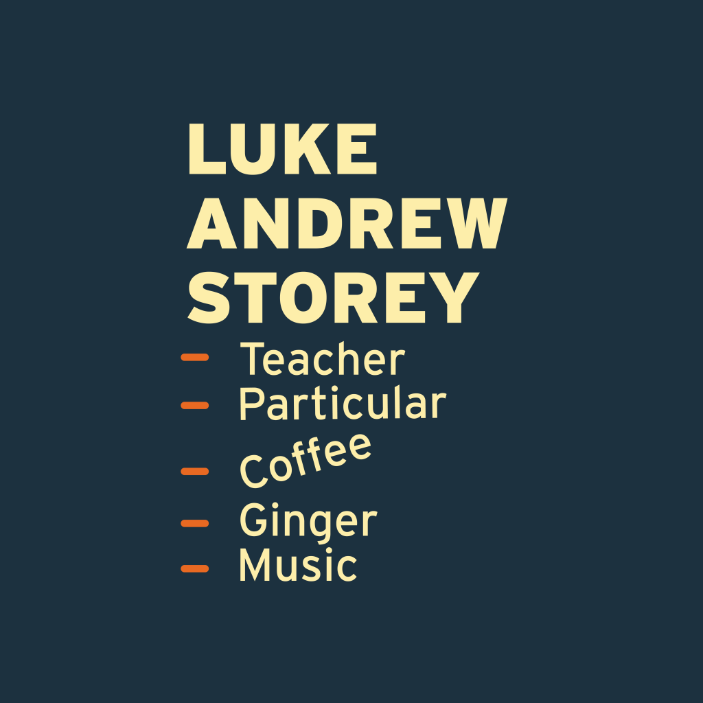
The responses really made me think about this really simple and clean design that shows me in a few words. Nothing extravagant – because that isn’t me. I am a simple guy (I think)…

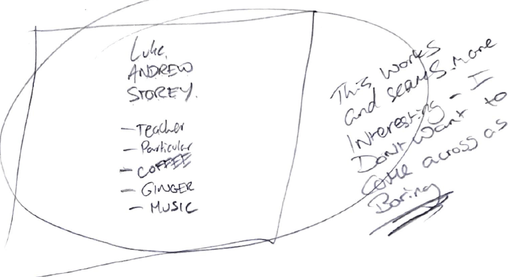
Within this, I started to think about how the panel could look, I wanted something simple that would summaries me as a person using the comments made by my friends. I thought a nice method would be to have my full name and list off 5/6 different things that make me, me. This concept would work, but there is nothing in it that would catch the attention of the viewer
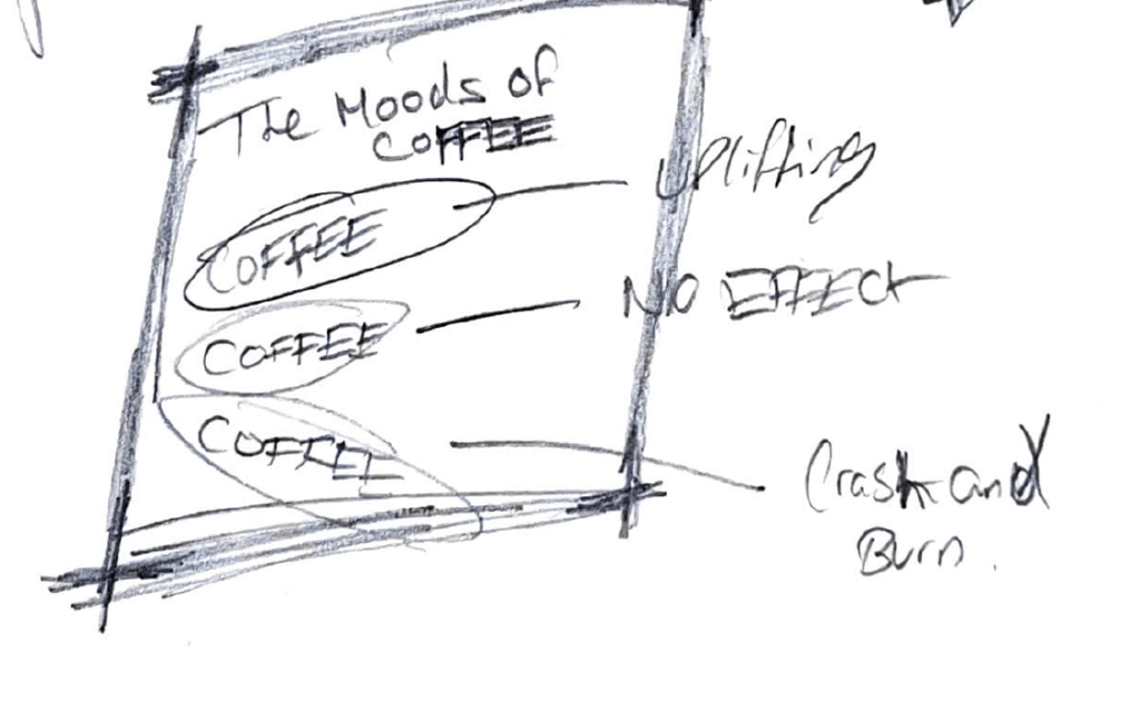
Progressing through this, I wanted to produce a pause within my list and I thought the word coffee would be the best word to do this. I started thinking about how coffee makes me feel after consumption and how I could express it within the word. Within this, there are three moods, ‘uplifting’ ‘no effect’ and ‘crash and burn’. 90% of the time, coffee makes me feel quite uplifted, so I decided to look at visually uplifting the word to an angle to show this within my list.
The final part of this was to show how this would look as a cohesive design and I think that this would work really well. I think that by having that break within the list, the viewer is able to consider the how the coffee was making me feel as a person
Colour Palette
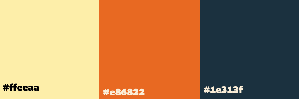
The colour palettes I have decided for this panel was a direct link to the previous panel. By doing this, I am allowing myself to see a direct link to who I am and where I am from. The use of orange again makes the work personal for me, even though it is in small doses within this panel.
Typography
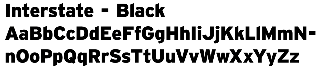

The typefaces that I have decided to use for this work is a mix of two weights from the font family Interstate. I decided to go with these two typefaces because these are my current go-to typefaces at the minute. I use them when I am pretty much doing anything design related in some way shape or form. They are clean and because the font family has so many different weights, it gives you plenty of ability to differentiate and gives you a lot to play with.
Final Outcome
This is the final outcome of the who am I? panel of the project. As shown in my previous sketches, I decided that I wanted to break up the list to give the viewer something to think about and I feel like this idea has worked quite well. Even though it is subtle, I think that it is just enough to give the design enough thought and show that elevation of mood from caffein consumption. I also love the fact that my colours link to my where am I panel and gives me a stable link between who I am and where I am from.

Leave a comment